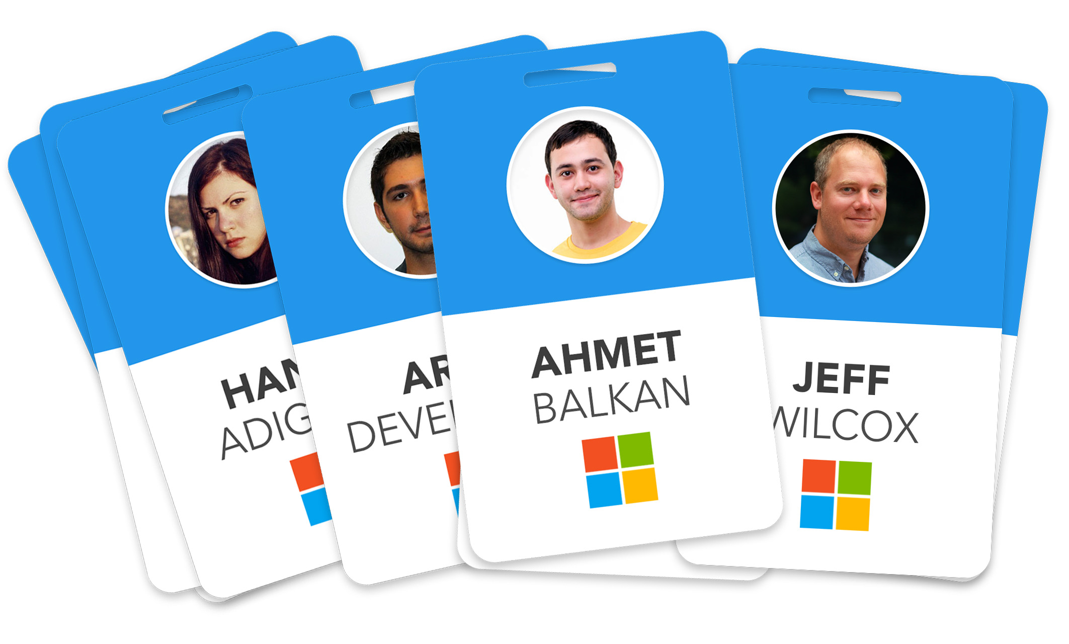
For a while, I had this idea of redesigning Microsoft employee badges for a modern and neat look. So I spared a few hours this weekend.
It’s over a year Microsoft has started to rebrand itself, starting from its logo to a brand new looking OS, from campus shuttles to direction signs on the campus and so on. Many employees are wearing this badge on their belts or pockets every day. So why not redesign this good ol' beast? Here we go.
Today
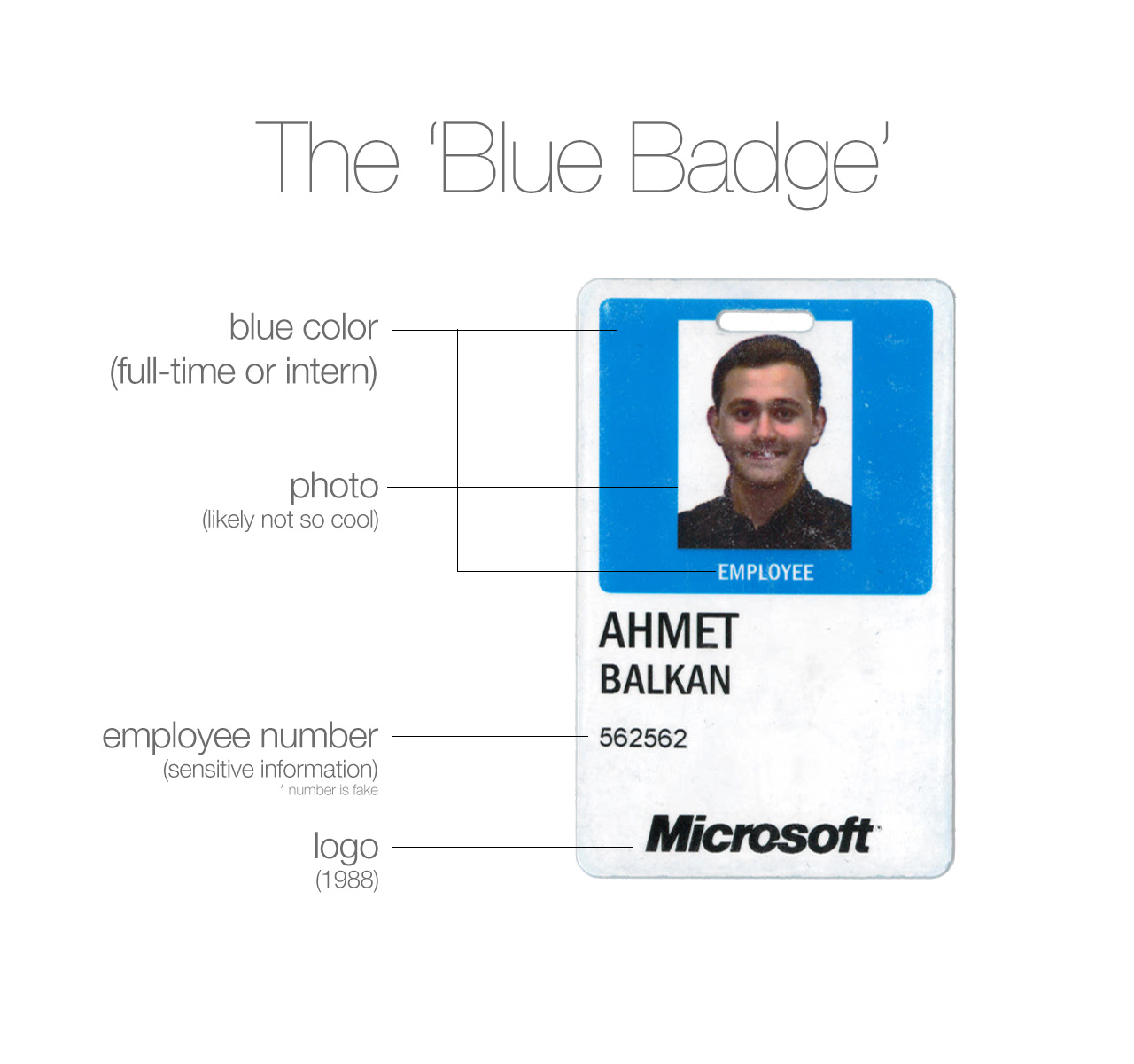
This has a few points I did not like. First of all, everything is aligned to left and there is so much unbalanced space here and there.
I also did not like my picture taken on the first day at work by someone who is supposed to take pictures of hundreds of people in a few hours and it is not like 20 pictures of you will be taken and you will choose. Also the print is not so decent, maybe it was just 8-bit color printing.
Reimagined
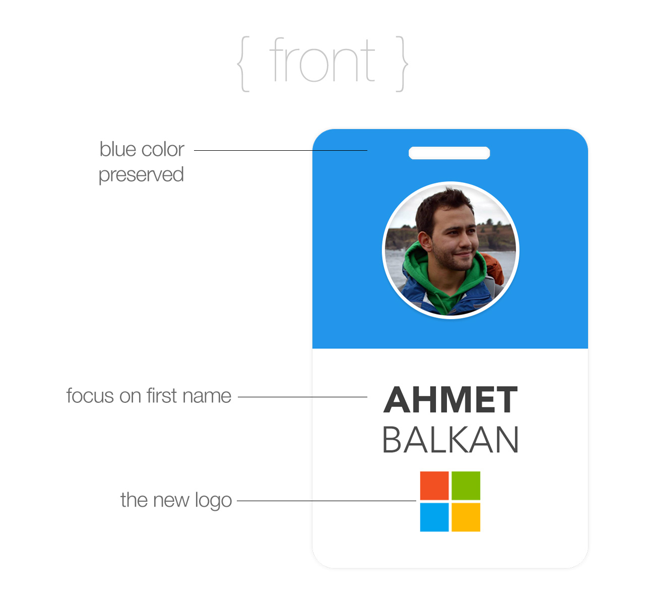
The new minimalistic look has several benefits. The front side just has what the person in front of you looking at your badge needs. Again, first name is highlighted using a heavier font weight than last name.
Also, the front side only has the symbol part of the logo. Microsoft is a well known company in the town as well as in rest of the world, so people would recognize the logo most of the time.
Pictures of the employees, I believe, should be picked and provided by them, and preferably should be on a solid background even though it looks even cooler on non-solid backgrounds.
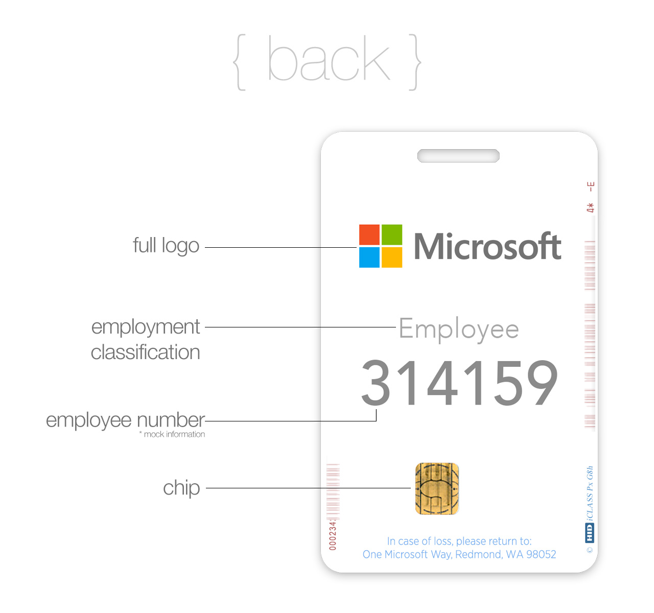
The employee number (which is something sensitive, for some) is moved to the back side of the badge:
What do you think?
Update: Dear fellow Microsoft employees and execs, thanks for showing huge volumes of support and appreciation on Yammer, emails and IMs. I am very glad you liked! Please consider giving
//kudosand spreading the word among your colleagues and on Yammer! :)
Update 2: Thanks for Hacker News folks who upvoted and commented! You have made it #1 on HN today and driven probably 20k people here. :)
Disclaimer
This experiment is my personal project and does not reflect any views or plans of Microsoft.
Leave your thoughts