Last year, out of boredom, I wanted to redesign the Microsoft employee badges.
I just got a piece of paper, started scribbling and in a couple of hours I came
up with a design that I later published as
This concept design received huge love internally at Microsoft as well as externally on Hacker News, Designer News, Reddit and many other platforms. At this point it is a good idea to admit that I am not a designer, I am a software engineer and this is not my day job.
I am thrilled to let you know that today, Microsoft has internally announced that my design will be adopted and all employees will be getting new badges with this new design. It is such a great pleasure to have designed something all my colleagues carry with them to work every day.
We're so excited about these new badges! Thank you @ahmetalpbalkan for your awesome design! http://t.co/tACHFPad2t pic.twitter.com/NcVKZBVopb
— Microsoft Design (@MicrosoftDesign) July 31, 2015Something I spent a couple of hours on and the branding team has iterated over later on has turned into an everyday item that I am sure every one of the 100,000+ Microsoft employees out there will be proud to wear.
Nearly not much had to change from the concept design to the implementation. Here is what the design I came up with and the new badges are going to look like:
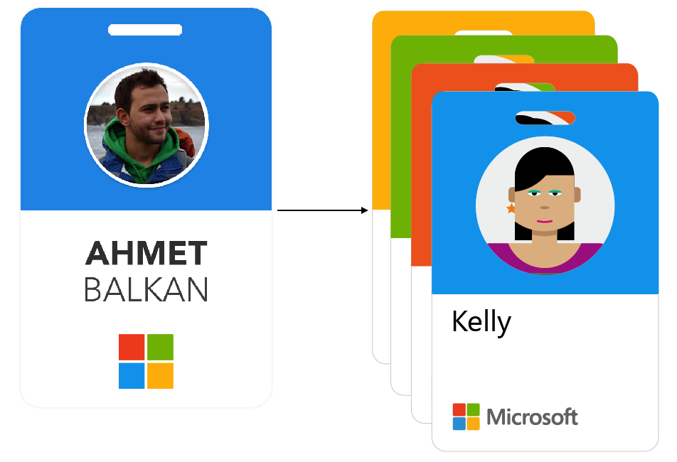
While the main idea remained the same, it looks like the new badges will be receiving the Microsoft logo with title and employee names will be left aligned instead of center aligned. I am not sure if there any of my ratios (see image below) made into the final design.
I am very glad this change is finally happening. Thanks everyone at Microsoft who is involved in this or showed their love from my colleagues all the way to our executives and the CEO! ♥
Here are some scribblings from the idea phase back then, click to zoom:
![]()
Leave your thoughts